

Brand design for a food business
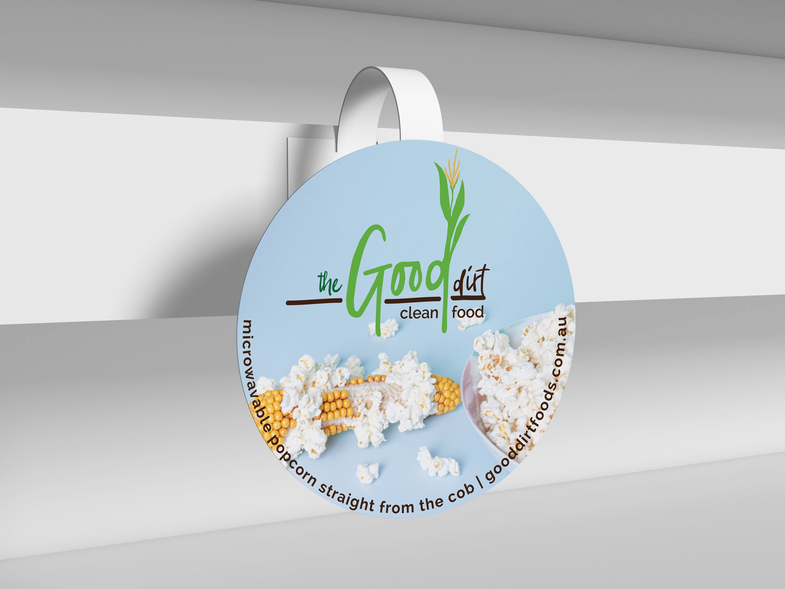
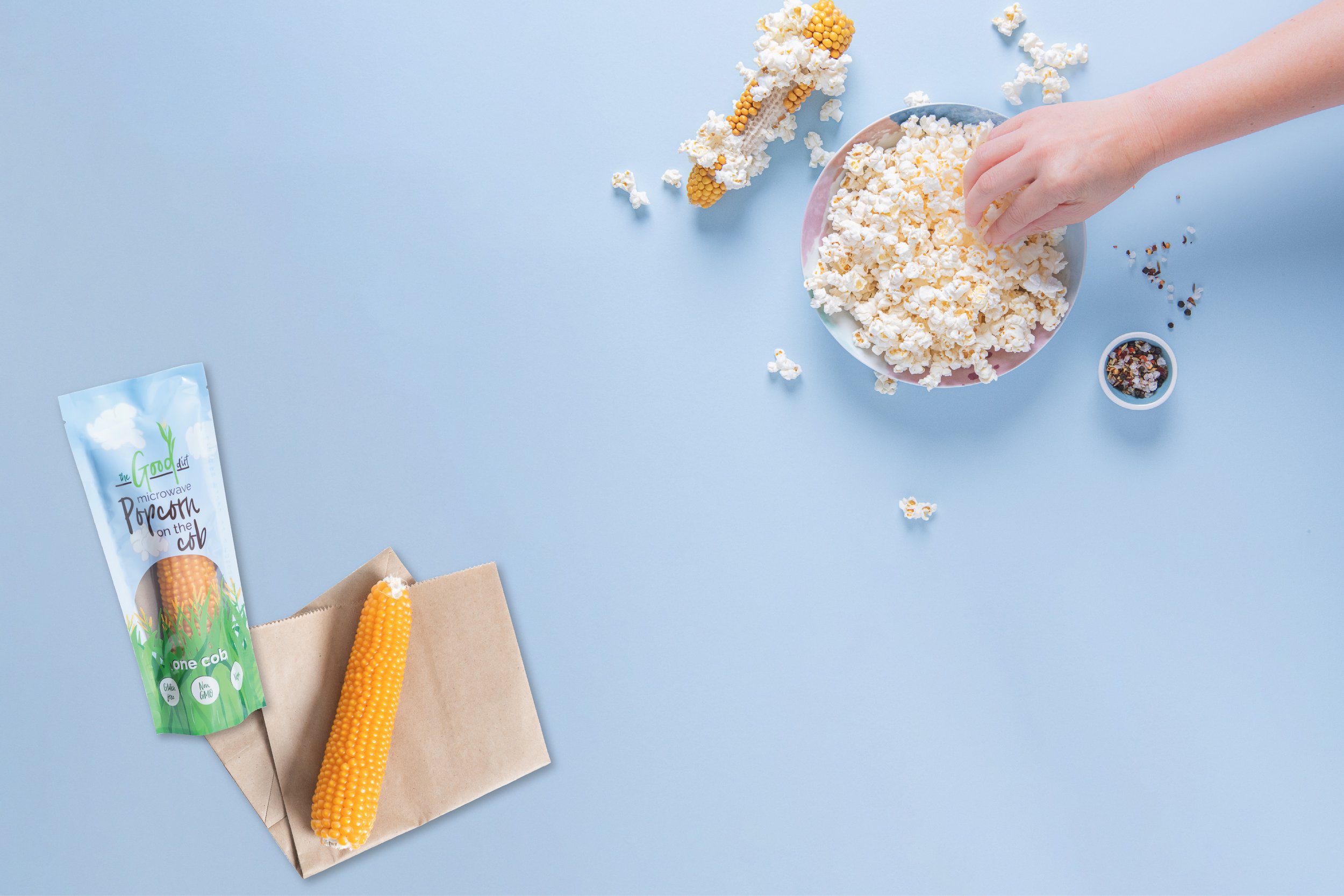
The Good Dirt nurture the soil and produce nutritious snack food. It’s popcorn, but not as you know it, because it’s popped straight from the cob.


The Story
The Good Dirt’s popcorn on the cob is is an unusual product, and it needed to be instantly understandable for consumers. The emphasis on regenerative farming was also vital, hence the name of the business and the product. These two aspects needed to be clearly demonstrated in the brand’s visual identity.
I dived deep to understand the aspects of the business that were important (including learning about regenerative farming)!
The solution is a brand design which is casual and handwritten in style. It includes an image of their hero product growing from the dirt. The packaging design is fun and approachable. It depicts a farm field scene with popcorn clouds and the window to the golden corn on the packet doubles as a rising sun over the cornfield. It’s fun and quirky and it stands out on the shelf.


Services Provided
Brand strategy and design
Full suite of logos
Packaging design
Label design
Print design – marketing materials
Digital design for the online shop
Creative collaboration with Webby Web Design (web design and development), Audrey Paige Communications (copywriting), and Lee Bird Photography (product photography)


“I highly recommend Blade Creative for all of your graphic design needs. Clare from Blade Creative has been exceptional to work with. She worked with us to develop our brand concept and in turn produced a logo, packaging and an assortment of marketing paraphernalia that we love and feel truly represent us!”
Leanne Pogue, via Google reviews
gooddirtfoods.com.au