Why you can’t “talk” about colour (and what to do instead)
Talking about colour
Clients often ask to “talk”. And on the surface, that sounds completely reasonable. But in reality, it’s one of the hardest things to do well. That’s because colour isn’t fixed. It isn’t objective. And it definitely isn’t shared in the way we often assume it is. When someone says, “let’s make it a bit more blue” or “can we look at a warmer white”, we’re not all imagining the same thing.
Colour lives in your head
Colour is shaped by experience. So what you think of as “white” might feel clean and crisp in your mind, while someone else might see that same white as cold or clinical. Another person might be picturing something softer. Creamier. Warmer. The same goes for every colour. Lighting changes it, screens distort it and materials affect it. Even what you looked at five minutes earlier can shift how a colour feels. That’s one of the reasons colour can have such a strong emotional impact. If you’re interested in that side of things, I’ve written more about the psychology of colour in branding. So when we try to “talk about colour” without seeing it, we’re relying on language to describe something that isn’t easily described. At best, it’s vague or confusing. At worst, it leads to misalignment.
Why this matters more in packaging
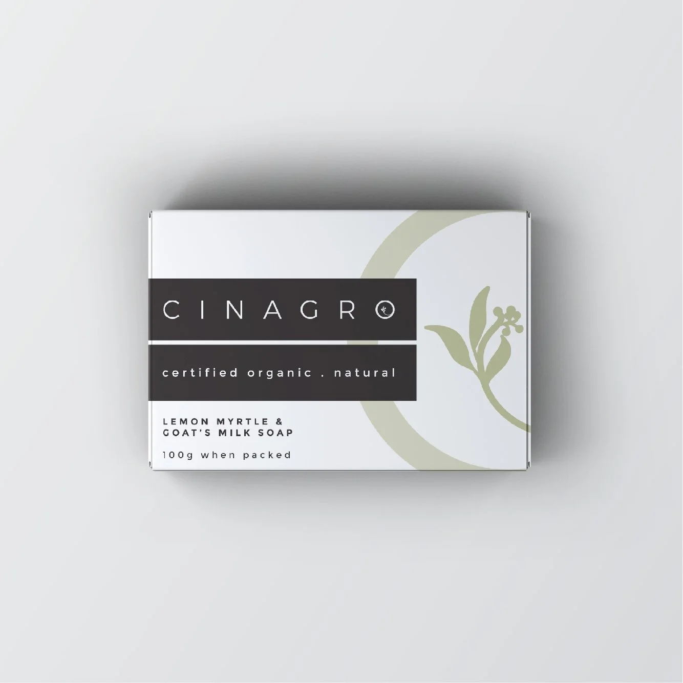
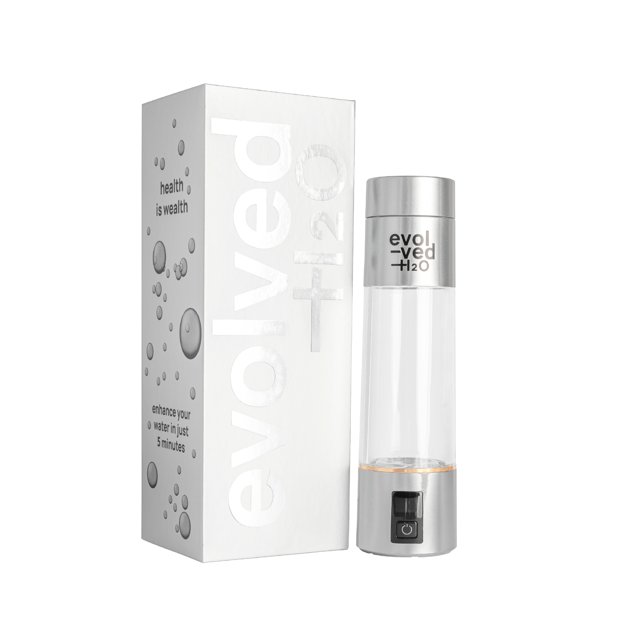
In branding generally, colour is important. But in packaging, it’s critical. That’s because colour doesn’t exist in isolation. It sits on a material, under specific lighting and surrounded by other products. A slightly cooler white might feel clean and modern on screen, but flat or grey in print. A warmer tone might feel premium on shelf, but dull if it’s not balanced correctly. Small shifts make a big difference.
And of course, colour often looks quite different on screen than it does in print, which adds another layer of complexity. I’ve explained that in more detail in this article about the difference between screen colour and print colour.
So what’s the alternative?
You don’t rely on describing colour. You make it visual.
That means:
looking at references (ideally in real life, not just on a screen)
comparing options side by side
testing colour in context
It’s not about finding the “right word”. It’s about finding the right result. And once you can see it, the conversation changes completely. You’re no longer guessing. You’re responding.
A simple example
This always reminds me of that old 12th Man sketch where they’re debating:
the cream, the bone, the off white, the white, the ivory, the beige
It’s funny because it’s true. One person is trying to describe the difference between several shades of white using words alone. And that’s exactly the problem. When colour is subtle, language can only take you so far.
Final thought
If you’ve ever struggled to explain what you mean when it comes to colour, you’re not alone. It’s not a communication issue. It’s the nature of colour itself. Which is why a structured, visual process isn’t just helpful. It’s essential.
If you’re trying to make decisions about colour, branding or packaging and keep going in circles, a more visual, structured process can make all the difference. Get in touch if you’d like help making confident colour decisions for your brand or packaging.