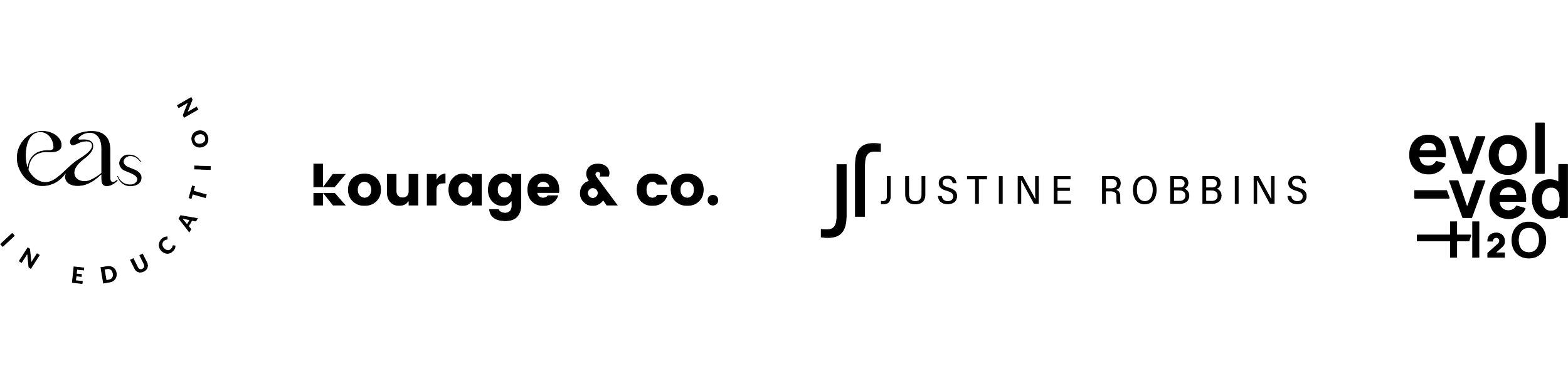
Simplicity is rarely simple
Interestingly, the most complex-looking logos aren’t necessarily the ones that take the longest to create. In many cases, it’s actually the opposite. That’s because the time in branding usually isn’t spent “drawing”. It’s spent thinking, playing with ideas and testing them.
The thinking is the hard part
Some highly illustrative logos come together relatively quickly because the direction is visually obvious. But simpler logos are often far more refined and considered than they first appear. When a logo becomes more minimal, every detail matters more. The spacing, proportions, typography, balance and overall feel all become much more noticeable because there’s nowhere to hide. Often, the challenge isn’t creating something elaborate. It’s refining an idea until it feels effortless.
Sometimes the best decision is removing something
I’m often reminded of the Coco Chanel quote: “Before you leave the house, look in the mirror and take one thing off.” In many ways, branding can work like that too. Often the real challenge isn’t deciding what to add, but understanding what can be stripped away. Removing visual noise usually makes the core idea stronger, clearer and more memorable.
Good branding needs space to evolve
That process usually starts long before any actual design work begins. It starts with conversations about the business itself: understanding the audience, personality, goals, positioning and how the client wants people to feel when they interact with the brand. A lot of branding work is really about identifying clarity. It’s also why I usually ask for at least three weeks after a brand strategy session before presenting concepts. Some of the most important thinking doesn’t happen sitting directly in front of a screen. Ideas often arrive when I’m out running, walking the dog, in the shower or suddenly awake at 2am thinking about a conversation from weeks earlier. For me, strong branding concepts need a bit of space to evolve and connect naturally over time.
It has to work in the real world
Once that strategic thinking is in place, the visual side becomes less about decoration and more about communication. A logo also needs to do far more than simply look good on a screen. It has to work across websites, packaging, signage, uniforms, social media, print, merchandise and supplier handovers. It needs to reproduce clearly at tiny sizes, in black and white, on different materials and across different applications. Some of the simplest-looking logos are actually carrying a huge amount of functional responsibility behind the scenes.
Simplicity creates flexibility
A heavily detailed logo can sometimes become restrictive quite quickly, particularly across digital applications or smaller formats. Simpler branding systems often adapt more easily, age more gracefully and create more room for the broader brand personality to evolve around them. That doesn’t mean every logo should be ultra-minimal or stripped back. Different businesses need different solutions. But it does mean that “simple” shouldn’t be confused with “quick” or “easy”.
Clear and effortless usually takes the most work
In fact, some of the most time-consuming branding projects I’ve worked on have resulted in the simplest-looking outcomes. Usually, the hidden work isn’t about making something look more complicated. It’s about making it feel clear, balanced, appropriate and effortless. And that kind of simplicity often takes a surprising amount of thought.