
Almost every branding project starts with the same aspiration: "I want my brand to stand out." It's a completely understandable goal. Nobody wants to invest in branding only to disappear into the background. But standing out, on its own, isn't enough. The strongest brands don't simply attract attention. They also make it easy for people to understand what they're looking at and remember it later. If your brand stands out for the wrong reasons, people may notice it but not understand what you do. If it blends in too much, they may understand it but never remember it. The real challenge is finding the balance between the two.
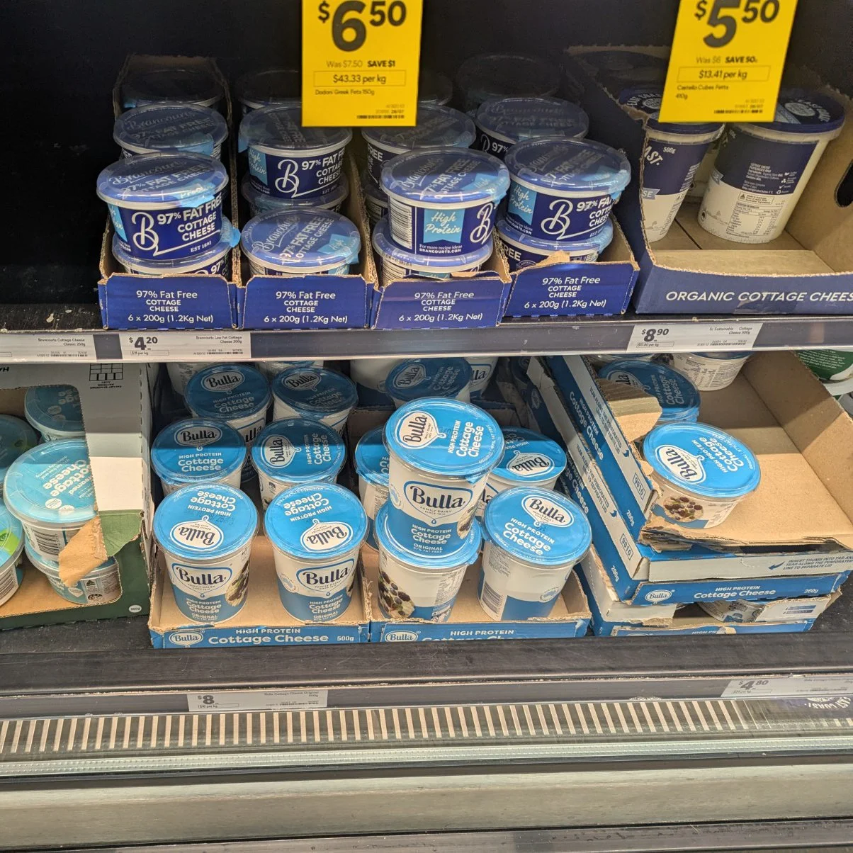
A friend reminded me of this recently when she sent me a photo from the supermarket. She'd gone to buy a particular cottage cheese that her husband likes, but all she could remember was that it came in a blue and white tub and the brand started with the letter "B". Standing in front of the shelf, she found herself looking at several products that all seemed remarkably similar. She picked the one she thought was right, took it home and discovered she'd bought the wrong one.
It perfectly illustrated the balancing act every brand faces. Your product needs to look like it belongs in its category, while still giving people a reason to recognise and remember your brand.
Every category has its own visual language
When you walk through a supermarket, you instinctively know where to look for different products. That's because every category develops its own visual language over time. Dairy products often use whites and blues. Organic products lean towards earthy greens and kraft colours. Luxury chocolate is frequently wrapped in dark colours with metallic accents, while children's cereals tend to be bright, playful and full of energy.
These patterns aren't there because designers have run out of ideas. They exist because they help customers make quick decisions. Our brains are constantly looking for familiar cues that reassure us we're in the right place. If every product deliberately tried to look completely different from everything else around it, shopping would become slow and confusing.
Most supermarket purchases aren't carefully researched decisions. They're habits. We're trying to get the weekly shop done efficiently, relying on visual shortcuts to guide us. We recognise colours, shapes, photography and packaging styles long before we read product names. Those familiar cues help us make hundreds of tiny decisions without stopping to think about every one.
It's very different to browsing in a boutique store or wandering through a weekend market, where people expect to slow down, discover new products and enjoy the experience. In a supermarket, your packaging has just a few seconds to communicate, "You're in the right place," before giving shoppers a reason to choose you over the products sitting beside it.
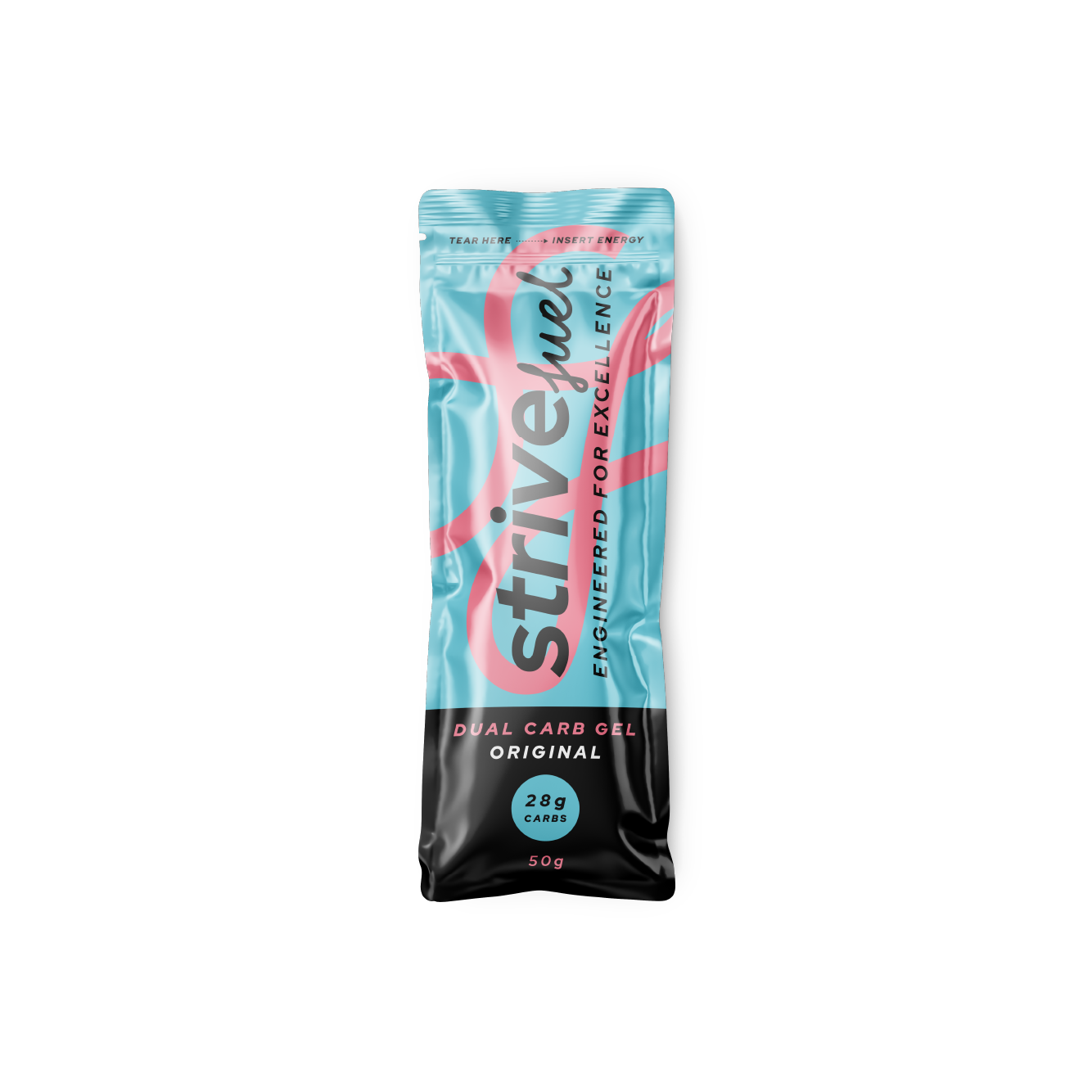
When I design food packaging, I don't start by asking, "How can I make this look completely different from everything else on the shelf?" I start by understanding the category. What are customers expecting to see? What visual cues tell them they're looking at an energy gel, a pantry staple or a baking mix? Those expectations become the foundation of the design, not something to fight against.
For Strive Fuel, the brief was to create something bright, energetic and performance focused. The bold graphics and vibrant colours immediately communicate movement and endurance, helping the product feel at home alongside other sports nutrition products while giving it a personality that's unmistakably its own.
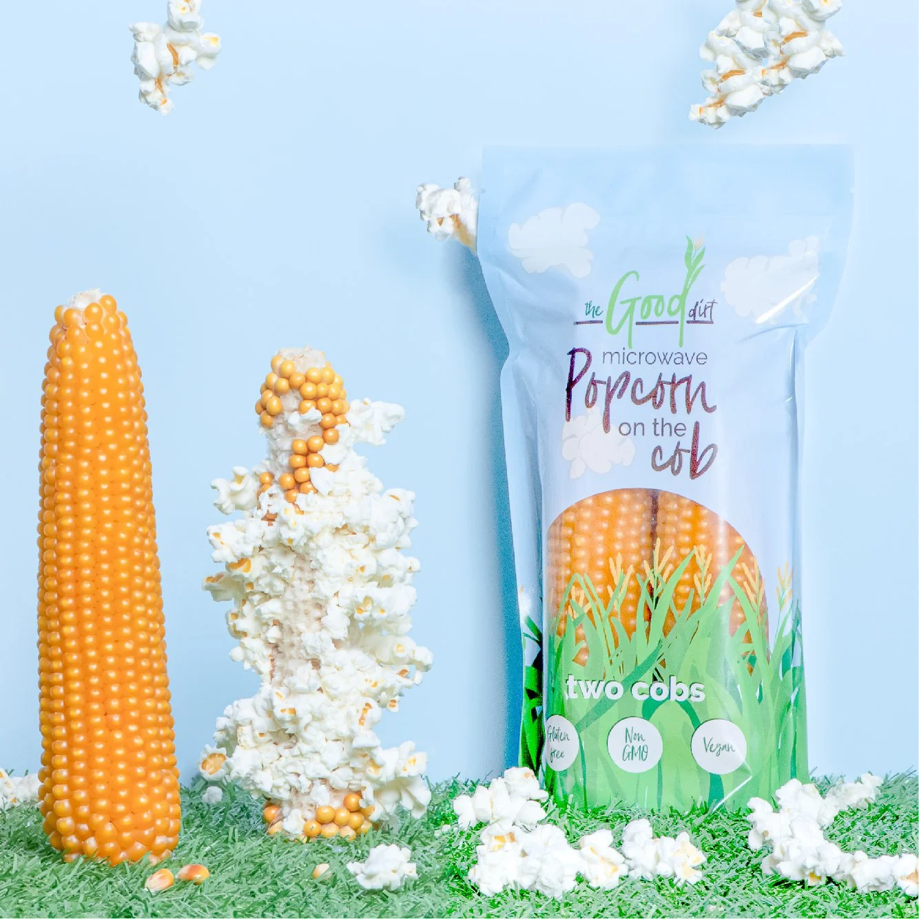
With Good Dirt Foods, the objective was completely different. It needed to feel healthy and natural, but also fun and approachable. The playful illustrations and fresh colour palette help it stand out while still fitting comfortably within the healthy food category.
When fitting in goes too far
Looking back at the supermarket photo, what struck me wasn't just that there were several blue and white cottage cheese tubs. It was that one brand appeared so visually close to another that, whether intentional or not, it became difficult to distinguish between them at a glance.
At some point, fitting in stops helping and starts becoming a problem. Trying to look like the market leader might result in someone picking up your product by mistake once, but you've done very little to build recognition for your own brand. If they enjoy the product but can't remember which brand they actually bought, they're just as likely to buy the market leader next time.
The strongest brands don't need to borrow someone else's identity. They understand the visual language of their category while developing distinctive assets that make people remember them. That's a far more sustainable strategy than relying on being mistaken for somebody else.
Finding the balance
This is why I often say that good branding is about making sure your business looks like it belongs exactly where it's sitting, while still being unmistakably itself.
Imagine opening a law firm's website that looked like a toy shop. It would certainly stand out, but probably not for the right reasons. Equally, imagine a café whose branding was so generic that you couldn't distinguish it from the five cafés next door. It would fit in perfectly, but it wouldn't leave much of an impression either.
The best brands occupy the middle ground. They understand the expectations of their industry, but they don't become invisible within it.
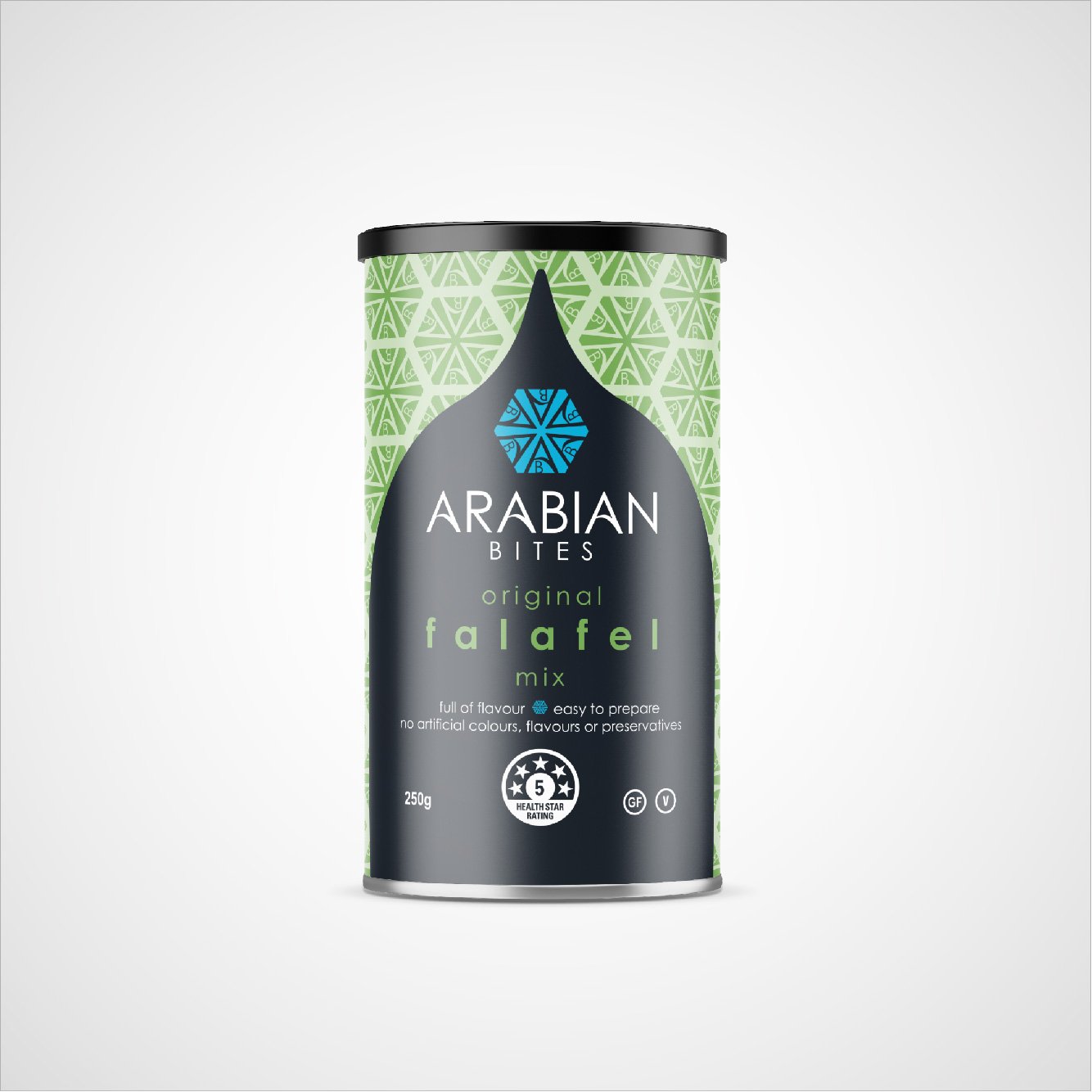
For Arabian Bites, authenticity was the priority. The geometric patterning and restrained colour palette reference the product's heritage without becoming cliché. It feels premium, trustworthy and exactly where you'd expect to find it, while remaining distinctive enough that you wouldn't mistake it for another falafel mix.
Humble Jumble demonstrates the same principle in a completely different way. Instead of competing with polished, corporate baking brands, the hand-drawn typography, soft colour palette and simple illustrations create a warm, handmade personality. It gives the impression of something made with care rather than mass produced, while still feeling completely at home in the baking aisle.
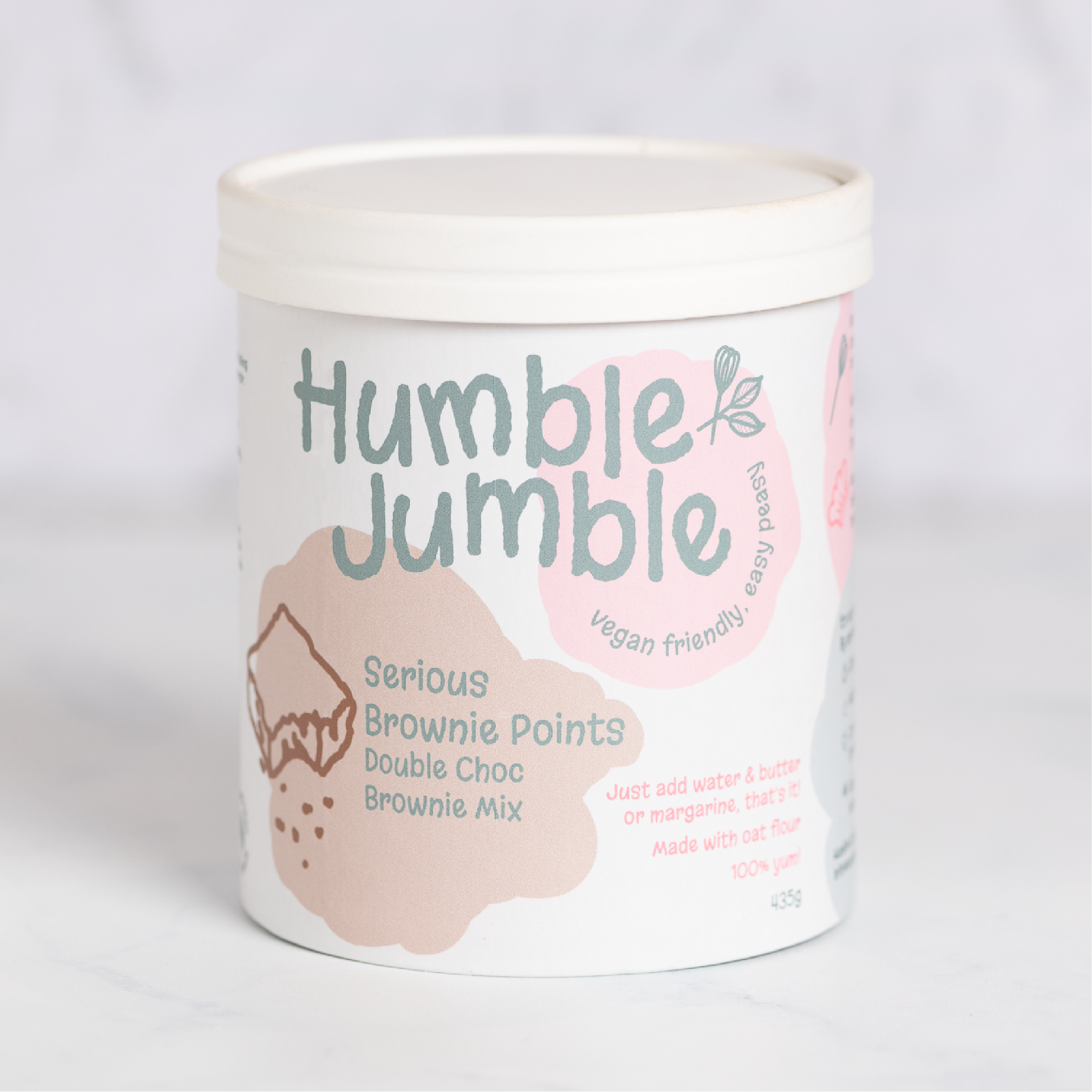
None of these products would work if you swapped categories. The sports gel wouldn't make sense as a brownie mix. The brownie mix wouldn't suit the sports nutrition aisle. The falafel mix wouldn't work as microwave popcorn. Yet none of them disappears into the background either.
Each one belongs exactly where you'd expect to find it because it speaks the visual language of its category. At the same time, each has its own personality, making it recognisable rather than interchangeable.
Standing out starts with fitting in
The supermarket photo wasn't really about cottage cheese at all. It was a reminder that branding isn't simply about making something look attractive. It's about helping people make decisions quickly and confidently, then making sure they can find you again the next time they need you.
Whether you're designing packaging, developing a visual identity or refreshing an existing brand, the principle is the same. People need to recognise that you belong before they can appreciate what makes you different. Your brand should feel familiar enough to inspire confidence, but distinctive enough to be remembered.
So yes, your brand should stand out, but first it needs to fit in. Then it needs to give people a reason to remember your business rather than the one sitting beside it. That's the difference between being recognised and simply being mistaken for someone else.