Building event brands
Building Brands That Build Themselves
Event branding is one of those areas where design, storytelling and strategy all come together. When it works well, it doesn’t just deliver for a single event. It creates something that can grow and strengthen over time, becoming more recognisable and more valuable with each iteration.
For this project, the aim was to build an identity that could evolve year on year. Something clear and confident, but flexible enough to adapt as the event develops, without losing its sense of continuity.
A System, Not Just a Logo
At the centre of the identity is a primary mark made up of an icon, the event title and a supporting line. Rather than treating this as a fixed logo, it’s been designed as a framework. One that can shift and expand as new materials are created and as future events come into play, while still holding everything together.
This kind of approach means the brand doesn’t need to be constantly rethought. It already has a structure in place that supports it as it grows.
Building on What Came Before
Looking at the evolution of the brand, you can see how that thinking carries through. The parent brand is clean and established, providing a solid foundation. Last year’s event identity introduced the upward-facing triangles, which brought in the idea of elevation and forward movement.
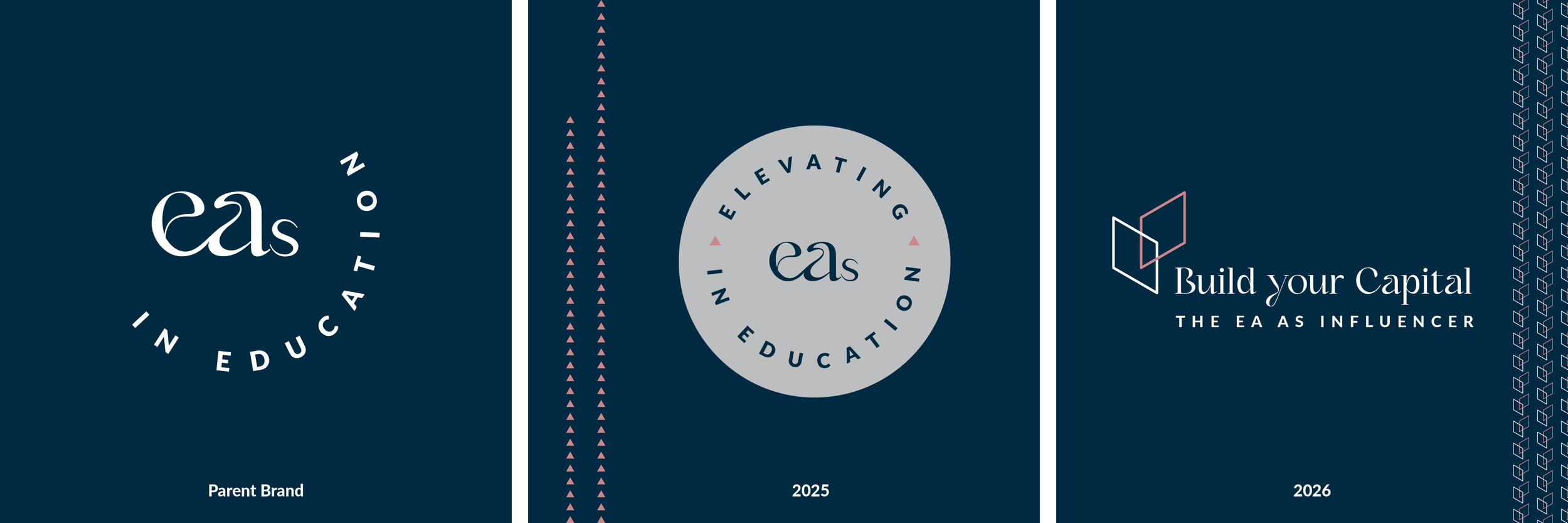
For 2026, that idea hasn’t been replaced, it’s been developed. The triangles become interlinking shapes that form a framework, shifting the focus slightly from elevation to building, while still feeling connected to what came before. It’s a subtle progression, but an important one.
The Icon
The icon itself is designed to be flexible. It can stand alone, repeat as a pattern or sit more subtly as a watermark behind content. This allows it to work across a wide range of applications without losing its impact or requiring constant adjustment.
That flexibility is what helps the identity feel consistent, even as it’s used in different ways.
Naming for Clarity
The event name was also quite long, so it was split into two parts. The descriptor explains what the event is, while the title captures what it stands for. Together, they create a clearer hierarchy and a more balanced overall mark.
It’s a small shift, but one that makes the identity easier to read and easier to apply across everything from printed programs to digital assets.
Designed to Evolve
Looking ahead, the structure stays consistent. The descriptor updates with the year, and the icon can evolve to reflect each event’s theme or focus. This creates a sense of continuity without feeling repetitive.
There’s no need to start from scratch each time. Instead, the brand builds on what’s already there, becoming more familiar and more cohesive over time.
The Brand in Practice
From there, it was about showing how the identity works in context. Applications like the event program bring everything together, demonstrating how the logo, icon and colour palette interact across layouts.
The system also translates easily across both dark and light backgrounds, with the palette adapting as needed while maintaining a consistent feel.
More Than a One-Off
Event branding doesn’t need to be reinvented every year. When it’s approached as a system, it becomes something much more useful. Something that grows, adapts and keeps doing its job over time.